Although my role at Restaurant Brands International began at Burger King, it quickly evolved to include contributions to the global expansion of Tim Hortons (Burger King’s sister company), where I helped develop a comprehensive visual identity system for the brand. My role included creating engaging toolkits to highlight the brand's commitment to high-quality, ethically sourced coffee. I led the design of the uniform system, ensuring a cohesive brand experience worldwide. Additionally, I developed a wide range of assets, from point-of-purchase materials to digital graphics, to support the brand's growth and customer engagement.
The following case studies showcase a variety of these projects.
TIM HORTONS
BRAND DEVELOPMENT
ART DIRECTION
CONTENT CREATION
PACKAGE DESIGN
DIGITAL DESIGN
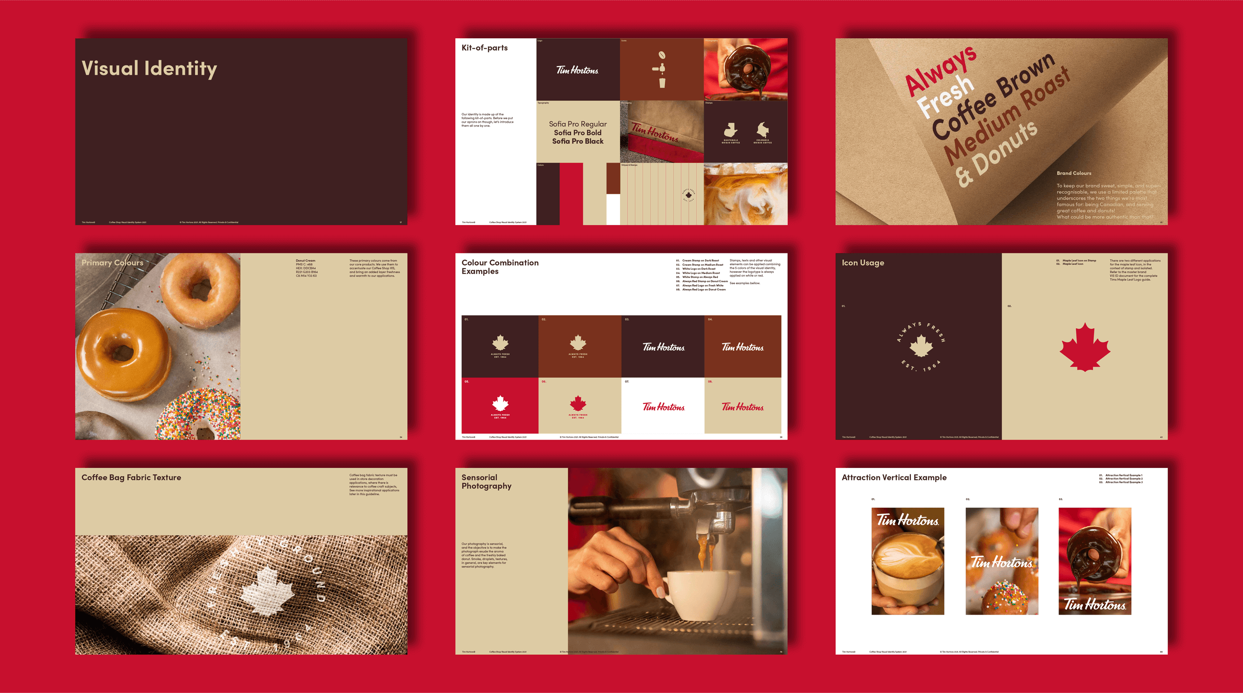
BRAND GUIDELINES
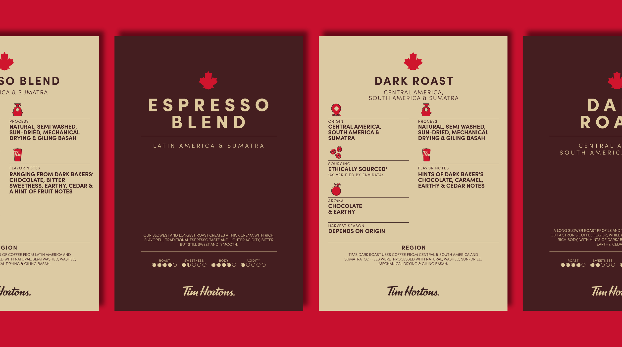
INTERNATIONAL COFFEE SHOP: VISUAL IDENTITY
The goal of the International Coffee Shop visual identity was to position Tim Hortons as a premium coffee brand on a global scale. The existing visual identity, deeply rooted in Canadian culture and hockey references, was not resonating with international audiences. To address this, we aimed to create a brand image that emphasized coffee quality and elevated the overall experience.
For this project, I collaborated with the external agency, Tatil, to develop a new visual identity system for Tim Hortons' international coffee shops. My role involved conducting a competitive analysis, providing strategic direction to Tatil, and exploring packaging and visual identity concepts. I facilitated internal and external reviews to refine the design direction and ensure alignment with brand objectives. Following the launch, I continued to support the project by creating essential assets such as digital graphics, icons, and point-of-purchase materials.

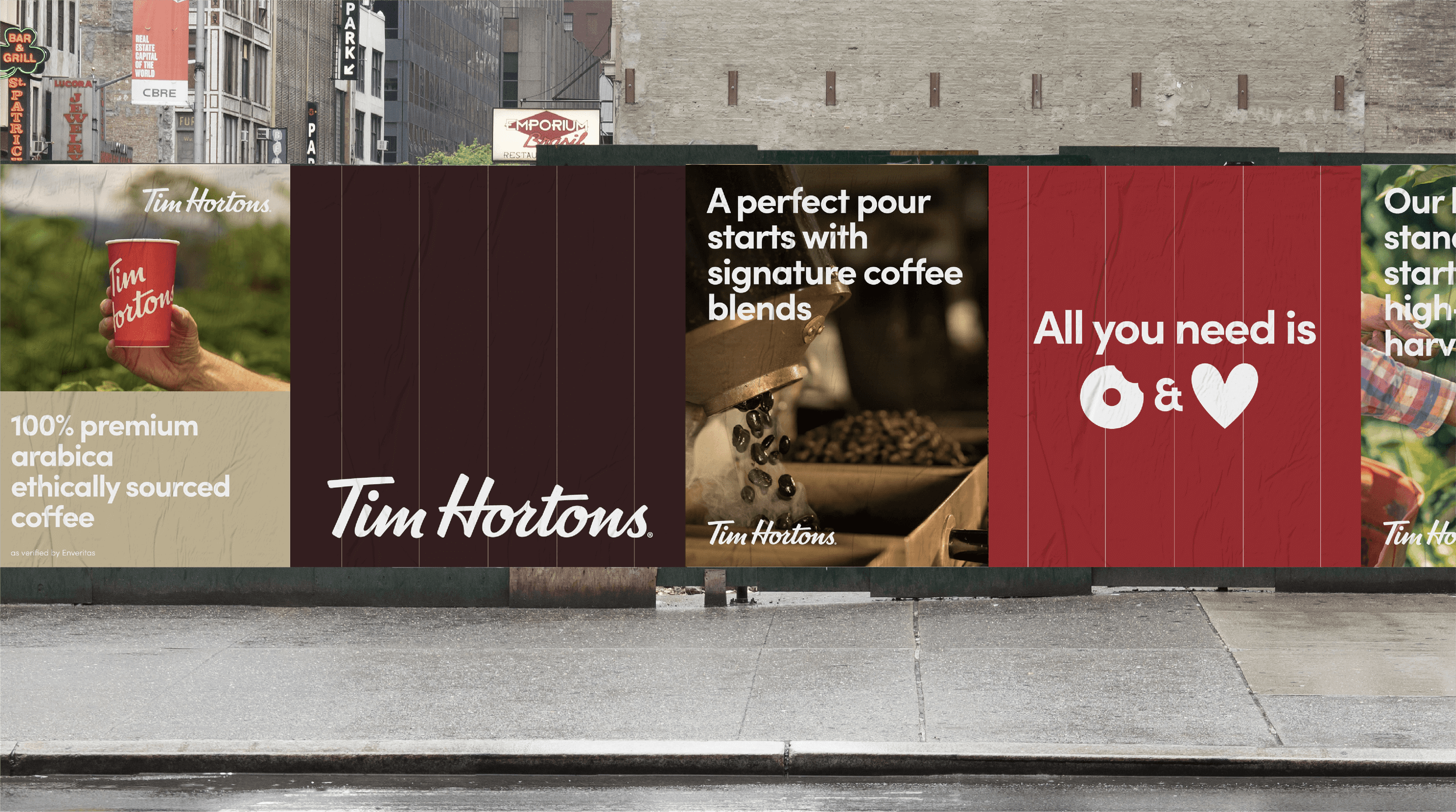
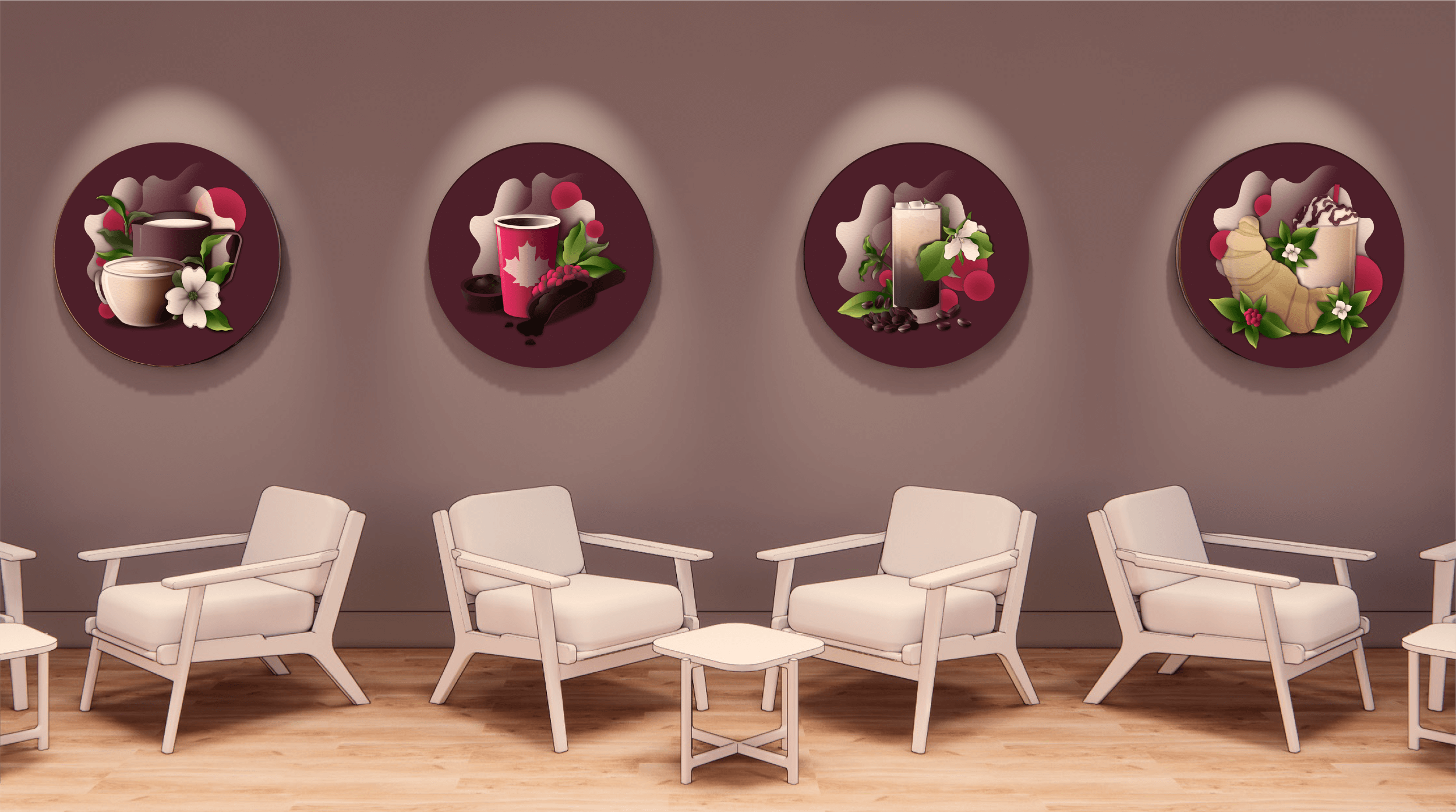
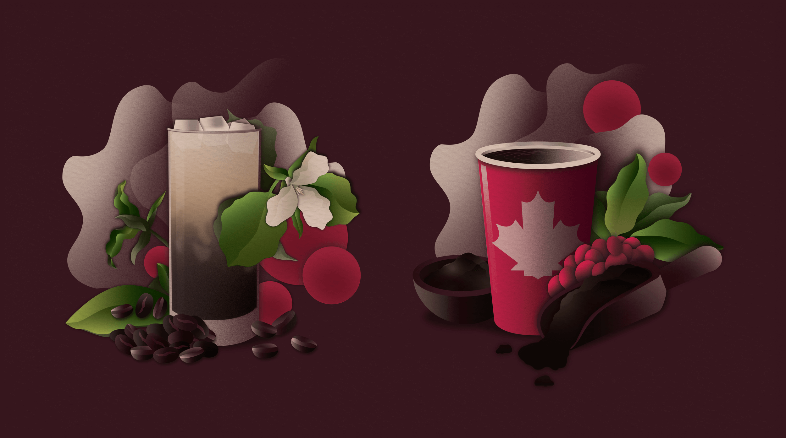
INTERNATIONAL DECOR
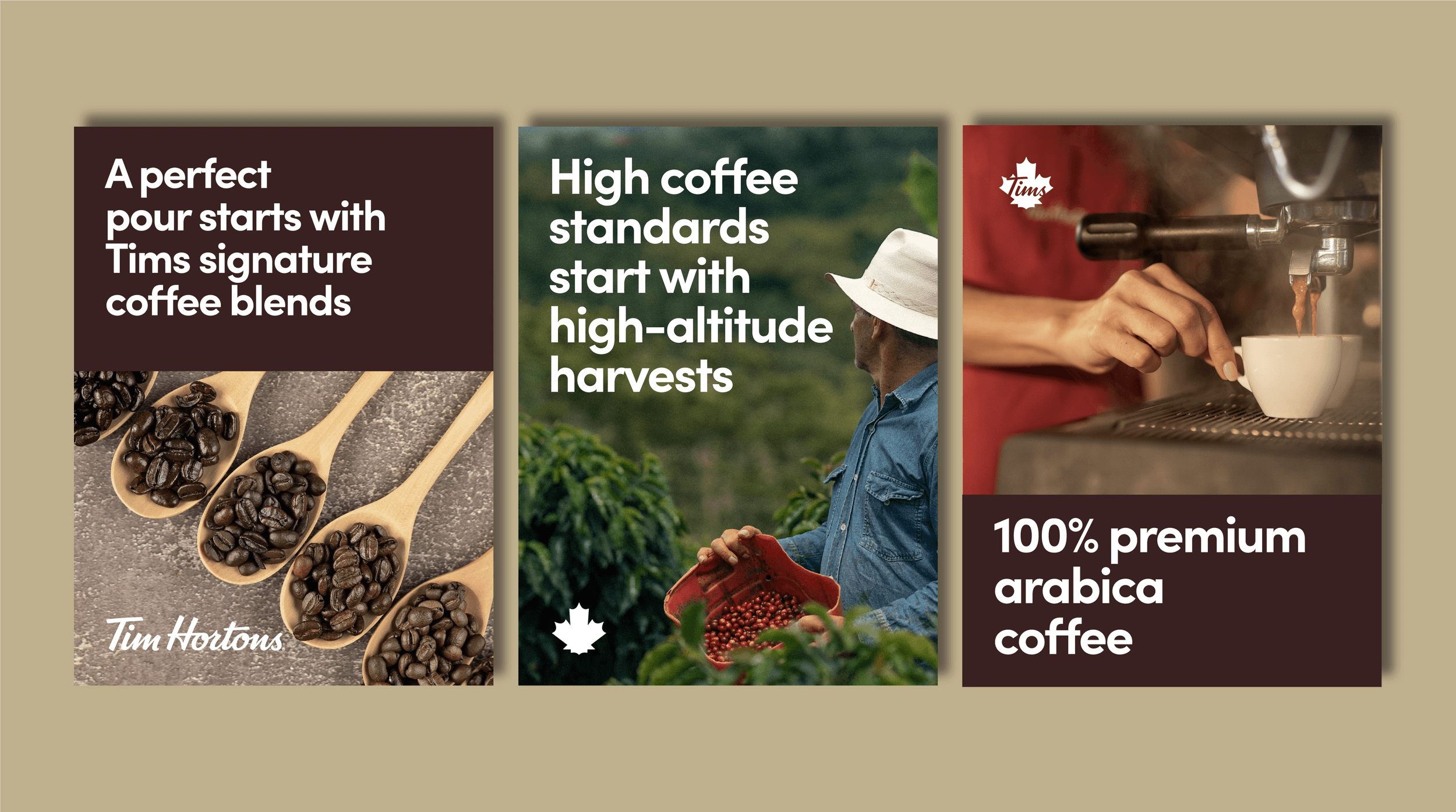
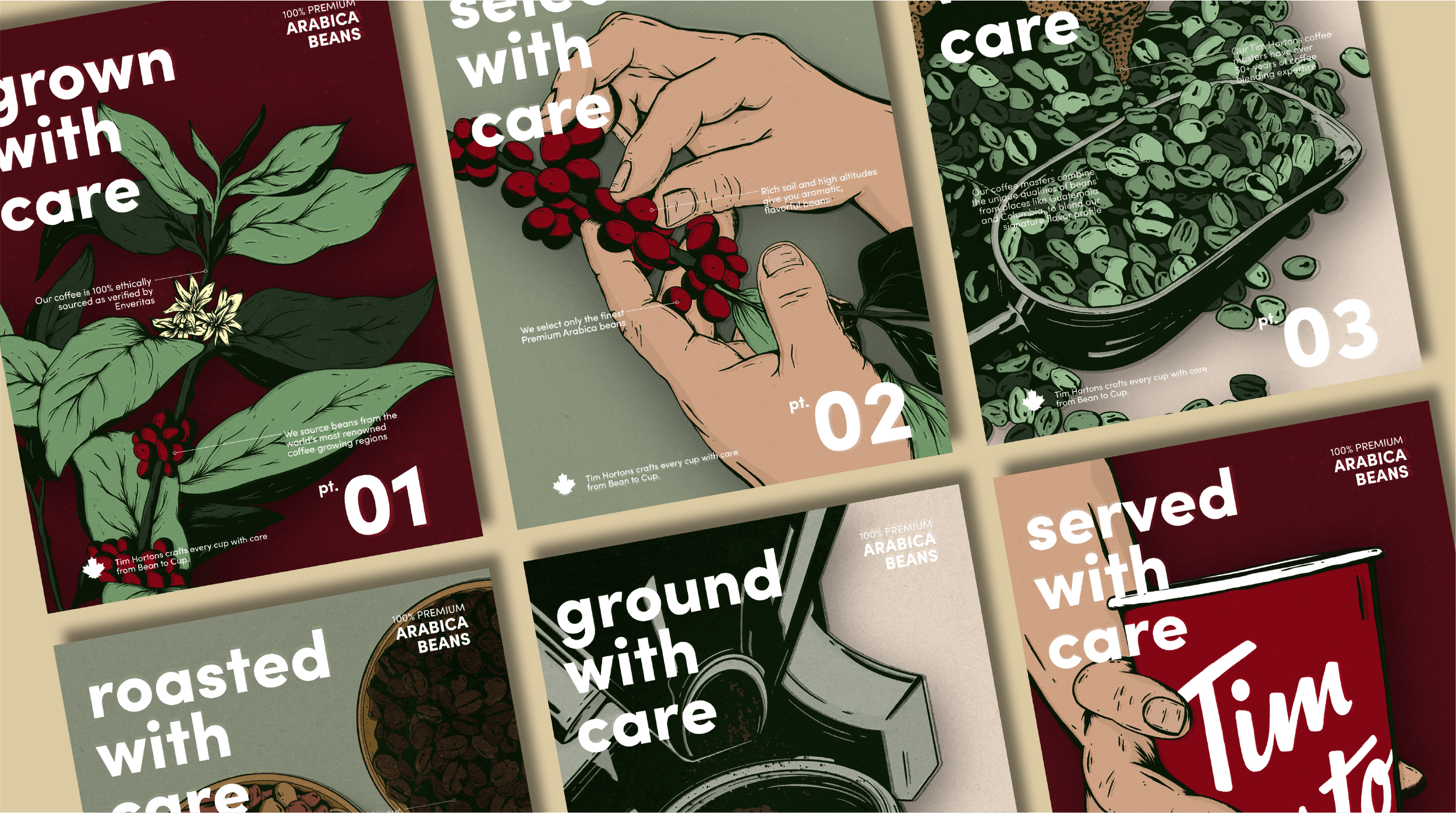
This section highlights my collaboration with the restaurant design team to create a range of assets, graphics, and wayfinding materials designed to enhance the customer experience at international Tim Hortons locations. Our goal was to replace the existing Canadian-centric imagery with a more premium aesthetic. As part of this project, I developed a series of illustrations showcasing key product offerings, such as coffee, croissants, and lattes. Additionally, I created a poster series that tells the compelling story of the brand's bean-to-cup process. This new design system is currently being implemented globally.
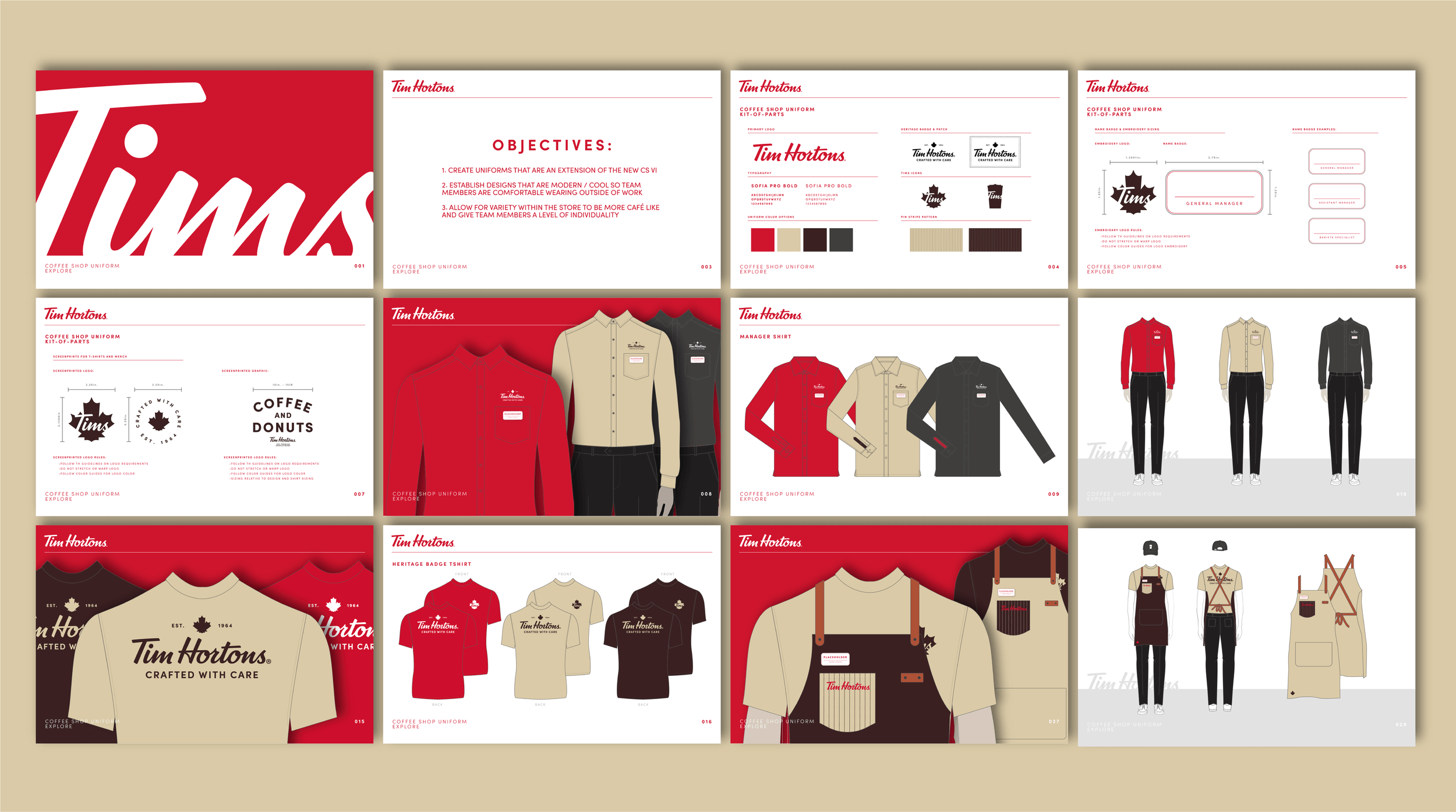
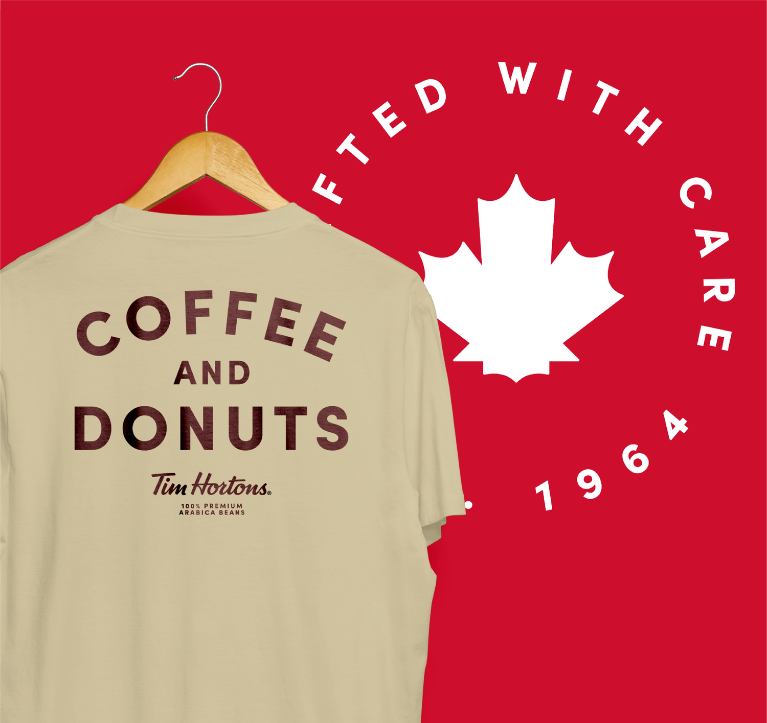
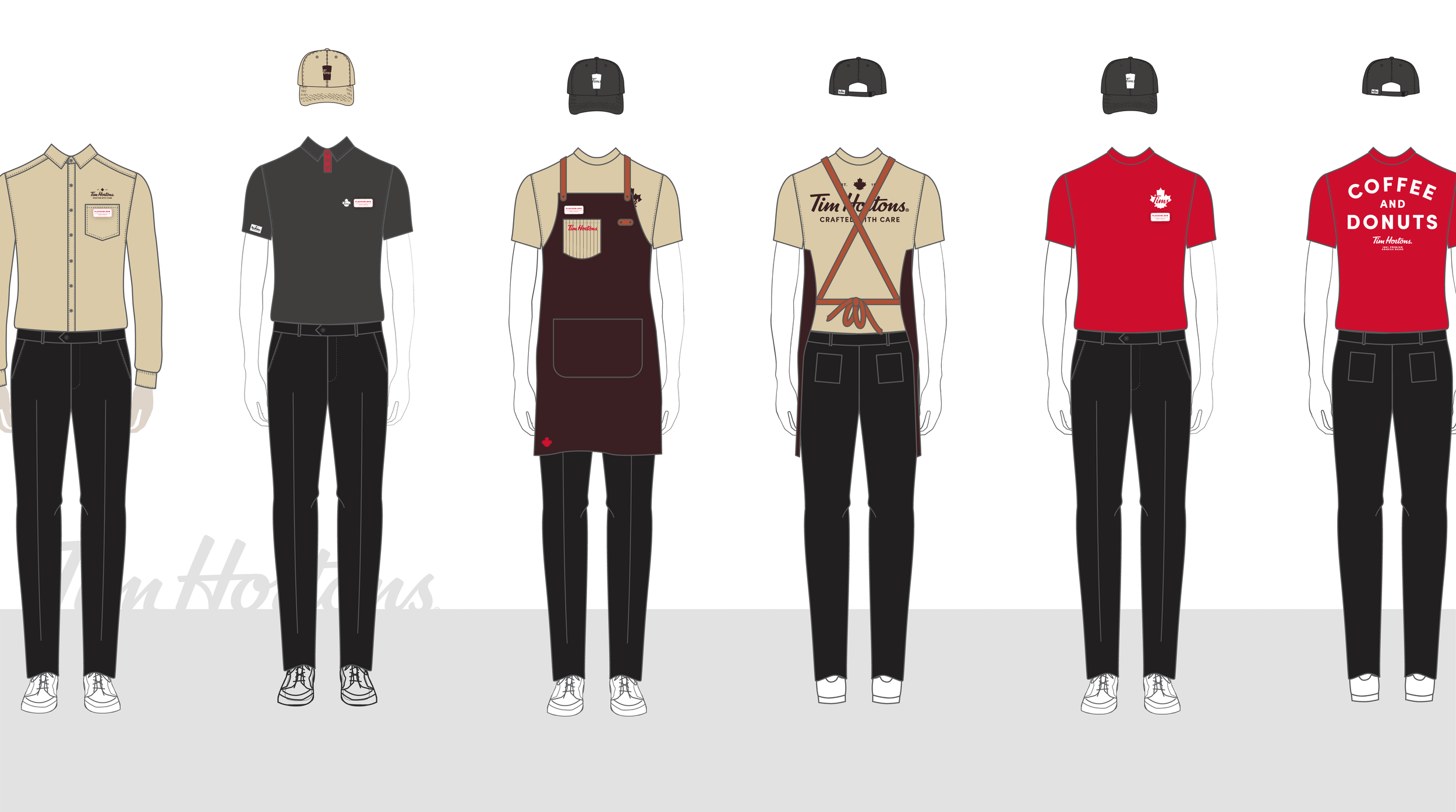
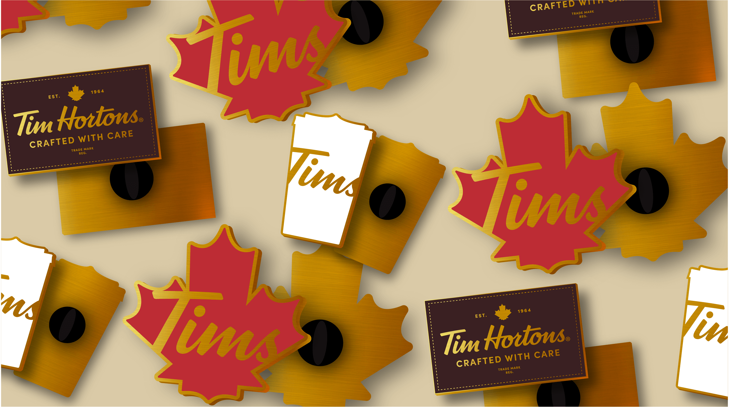
INTERNATIONAL UNIFORM SYSTEM
I also spearheaded the development of the international uniform system for Tim Hortons. This comprehensive project encompassed everything from establishing the color palette to designing graphics, name badges, pins, and aprons. I created a detailed kit of parts, including various sizes, to accommodate the needs of all employees, from crew members to managers.
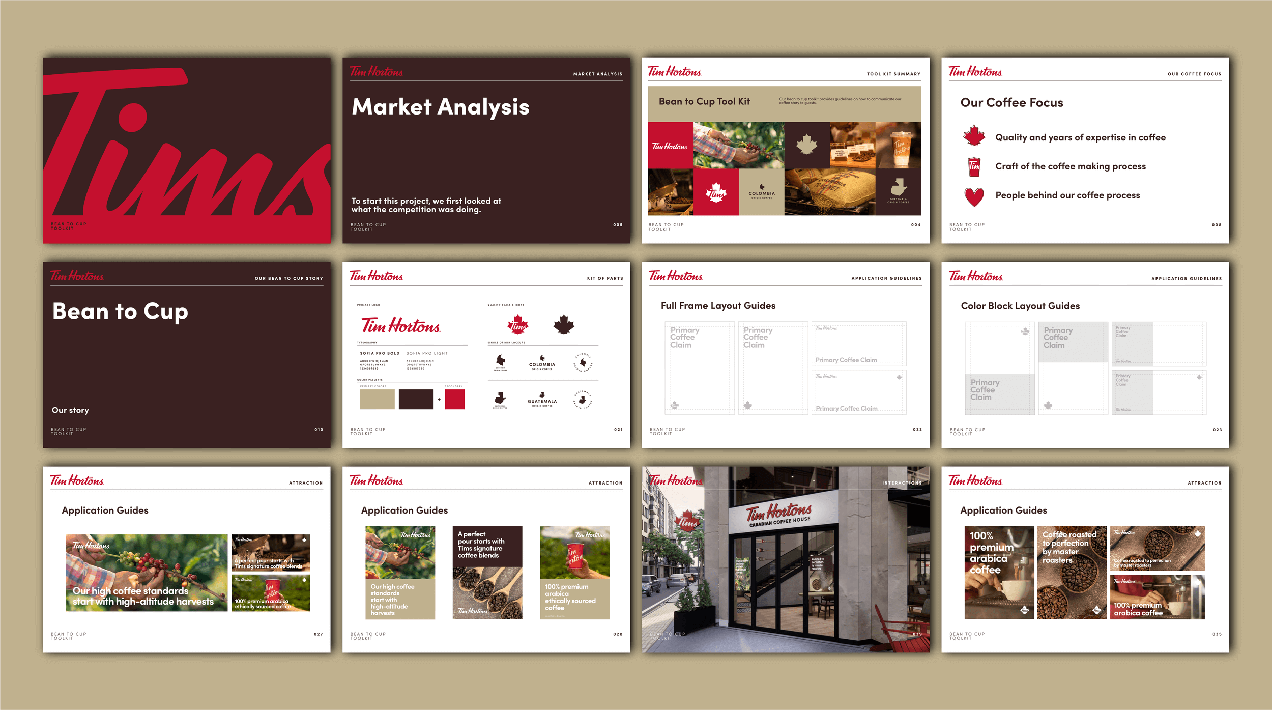
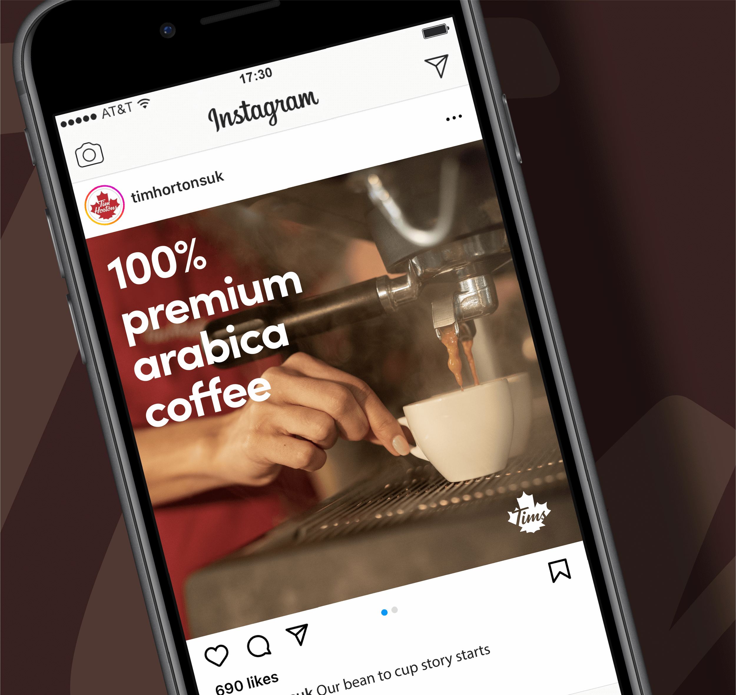
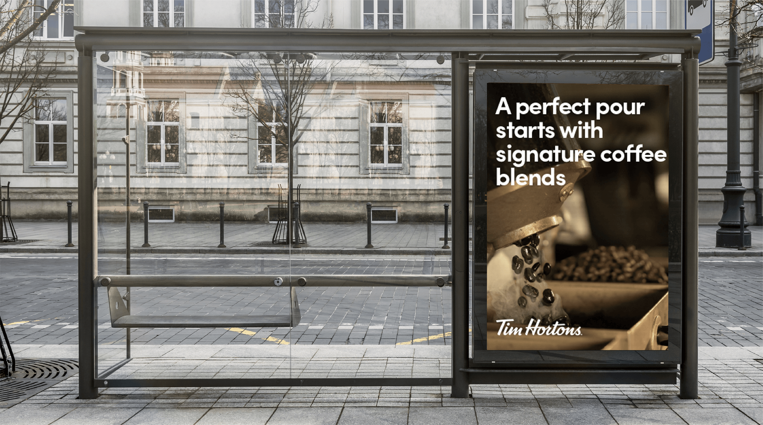
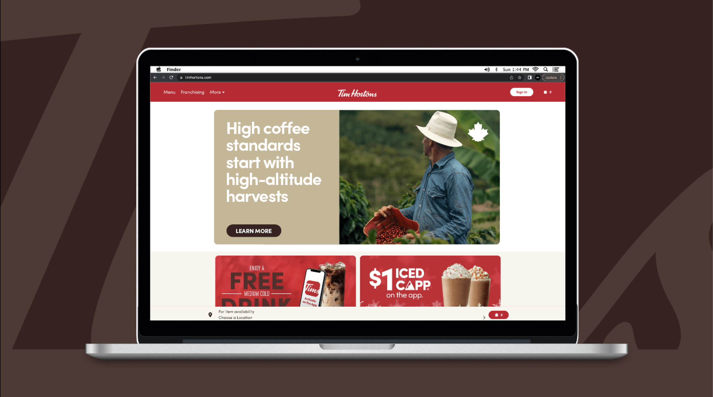
BEAN TO CUP TOOLKIT
In collaboration with the marketing team, I developed an international toolkit to showcase the bean-to-cup process. My responsibilities included creating a standardized merchandising system for point-of-purchase displays, OOH and digital, and contributing to the development of supporting copy.